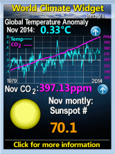
Here's some analysis done online with this database. You can play with the data to see for yourself the trends of the so called global warming. I have used the NOAA GHCN Database with stations around Canada. Look at the graphs for details of how I created the graphs.
Here's two example


So you may ask, how did they get graphs showing warming? Good question. The short answer is adjustments... See this article for more information on the subject.
WHY THE COMPUTER MODELS ARE DECEPTIVE
-
Read why the climate computer models are giving a false view in this easy
to follow article.
Climate change computer projections are erroneous and misle...
Il y a 2 heures


Aucun commentaire:
Publier un commentaire