Climate scientists are 95% confident that humans are responsible for at least "half of the observed increase in global average surface temperatures since the 1950s." source
There's some much to be said about this report, but let me start by a couple of graphs.
First this one:
The IPCC graph shows that climate models predicted temperatures should have responded by rising somewhere between about 0.2 and 0.9 degrees C over the same period. But the actual temperature change was only about 0.1 degrees, and was within the margin of error around zero. sourceYou see from this how "mushy" the models are and how they do not track the real observed temperature of the planet. In reality, the observed temperature change is not a big issue, but what the models show are. But if we cannot rely on models, why are we believing in them so blindly? In the words of Ross McKitrick here:
The IPCC must take everybody for foolsHere's some other graphs and sources on how the models are way off from reality.
 | |||
| source |
 |
| source |
So who is the IPCC anyway? The best video I have seen on this subject is embedded below (source)
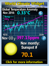
What are the real life observations are showing? You can play with the numbers yourself by clicking here. This graph shows the whole of the HADCRUT 3 unadjusted global mean temperature data set. We can see that for the past 15 years 1998-2013 we have seen no increase in global temperature while the CO2 (blue line) kept increasing in a linear fashion. So if CO2 is driving the temperature rise, why have we seen a ZERO increase for 15 years?
When you look at this, always remind yourself that this is temperature anomalies. To better understand what this is, please read this article.
It's interesting to see the real temperature swing. Here's an example from Quebec City from 1978. Can you see a temperature trend? Compared this monthly average of around -15c to +15c or 30 degrees C with the above graph range of -0.2c to 0.6c or 0.8c (anomalies) for the same period.
You also have to note that this station is near a big city that probably saw the "heat island effect"
Another thing you have to consider, is the question of how much human made CO2 is in the atmosphere. here's a quick video on that subject.
So has you see from the tip of the iceberg view on the climate debate... it's not that clear cut.
More sources of information
- Judith Curry blog: 95% ?
- Watts of with that
- Blog of Donna Laframboise on here continues investigation of the IPCC.


